
I love marvel comics, and am inspired by Jack Kirby, so i created this collection of art. It took me a long time, and I ended up rushing a few parts of each image so I could finish by the time Age of Ultron was released in cinemas. Please email me if you would like any more information about how I done these peices or if you want me to do a peice for you.
wesley.newman@hotmail.co.uk
All of these images started from an image on google created by Marvel Comics artists..

Fantastic Four- My biggest challenge making Marvel characters due to the complexity of The Thing. I had to rush towards the end as you can tell by looking in the right hand side. The Thing took me 3 hours/ because of the amount of individual shapes l've made. Human Torches flame trail was originally going to have lots of colours but when I made the yellows background for the trail I thought it looked effective so kept it haut was.

Carnage - I made carnage a deep red to show a darker character. Marvel comics often used to use a bright red. This is my favourite peice due to how recogniseable he is and the tone the image makes. I love how the psychoticnes of Carnage is shown my version of this image. I also love how the character "skin" flows, just like a liquid alien I that becomes a suit should be (in my opinion).

Galactus - I used the planets to make Galactus look bigger as he is 'The Destroyer of Worlds. I think that I should have made my own planets so they look less like the've been photoshoped into the image. This is the most original pieces l made I because of the way I added the outer space in the image. I experimented with shades and gradients in this. I think the effect is good but I need to try and make each color in the gradient less obvious.

Green Goblin - This is one of mg favovrite characters. I used more line in this I which I was hesitant to do but creates an effect that looks effective, and true to the comics. With this the picture I used was very pixelated, forcing me to make up more of the image. This was hard because getting colours from the image didnt look right, and test bringing up yellows. I created my own colour pallete from what I imagine the Green Goblin should be like.

Hulk - This is the worst of my images. I struggled to make the varying degrees of greens and when the image was exported it came out darker than I hoped. The legs look very dark and the shapes are too strong on the upper body, but I like how the rage shows In Hulks face, which is the true spirit of the character in the comics.
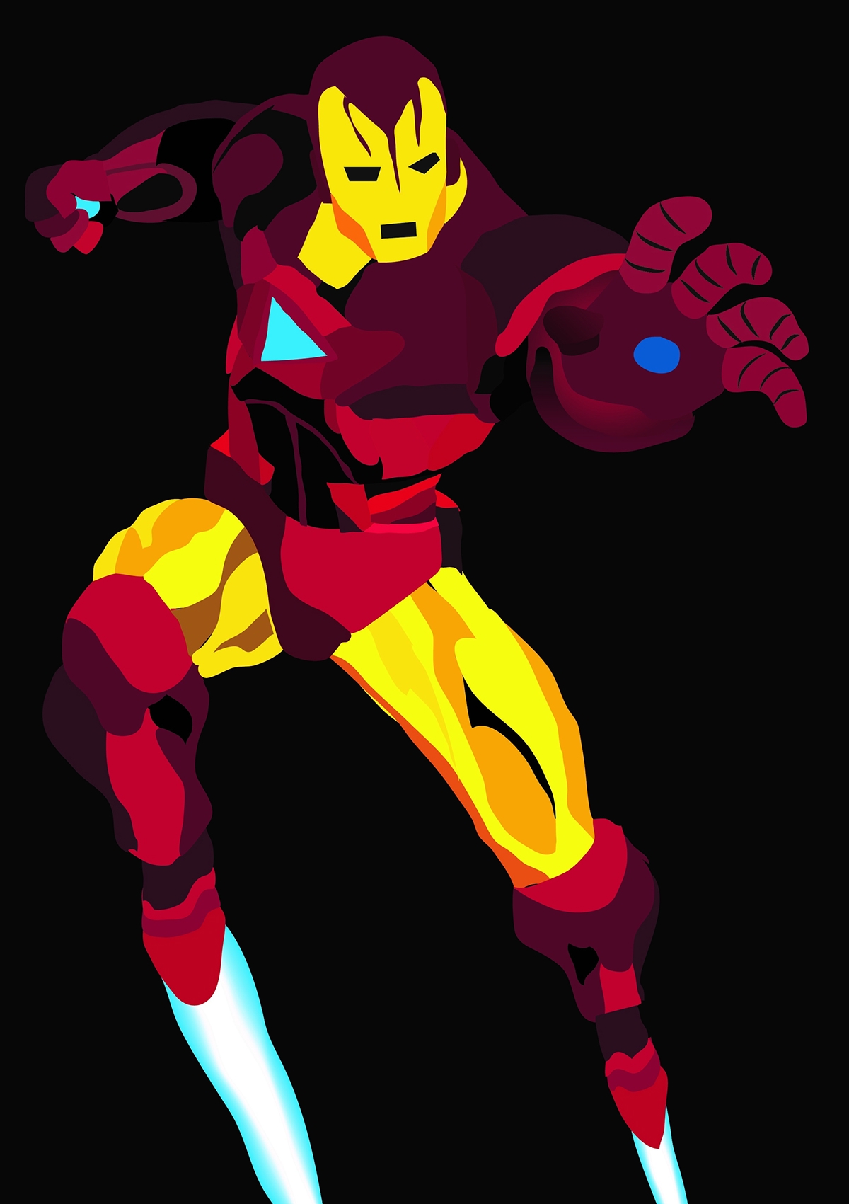
Iron Man - This is one of my favourite characters. I managed to make the colours look metallic and robotic, while making it stay true to the comics. I could have spent more time making more accurate lines but I feel that would ahve made the image differ from the comics to much. The hands don't look metallic enough. I like the way the "flames" that come out the feet look.

Sinister 6 - This is my favourite super villain group of all. This image gets the characters from their original appearences and has a very big impact. I experrimented with effects on Sand Man to make it grainy. I feel I should have spent more time on the smoke, to make it look more realistic.

Silver Surfer - This was the hardest character as silver is hard to make look like silver in an image, and I feel I've succeded. I like how the 'light' shines off the character, but i should have spent more time making the board a realistic colour.
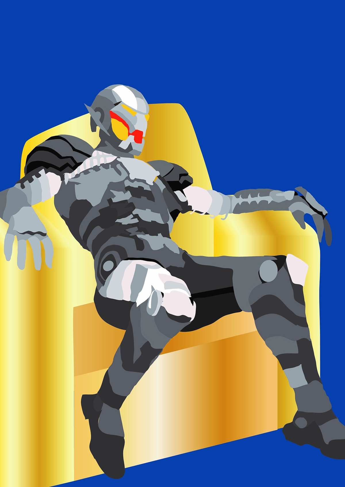
Ultron - I found making Ultron amazing. It was hard to make a dark character look so detailed. I feel the the throne ruined the image, but after designing Ultron around a chair of some sort I felt it was needed.


